From Concept to Completion: The Team Liquid Jersey
June 27 2018
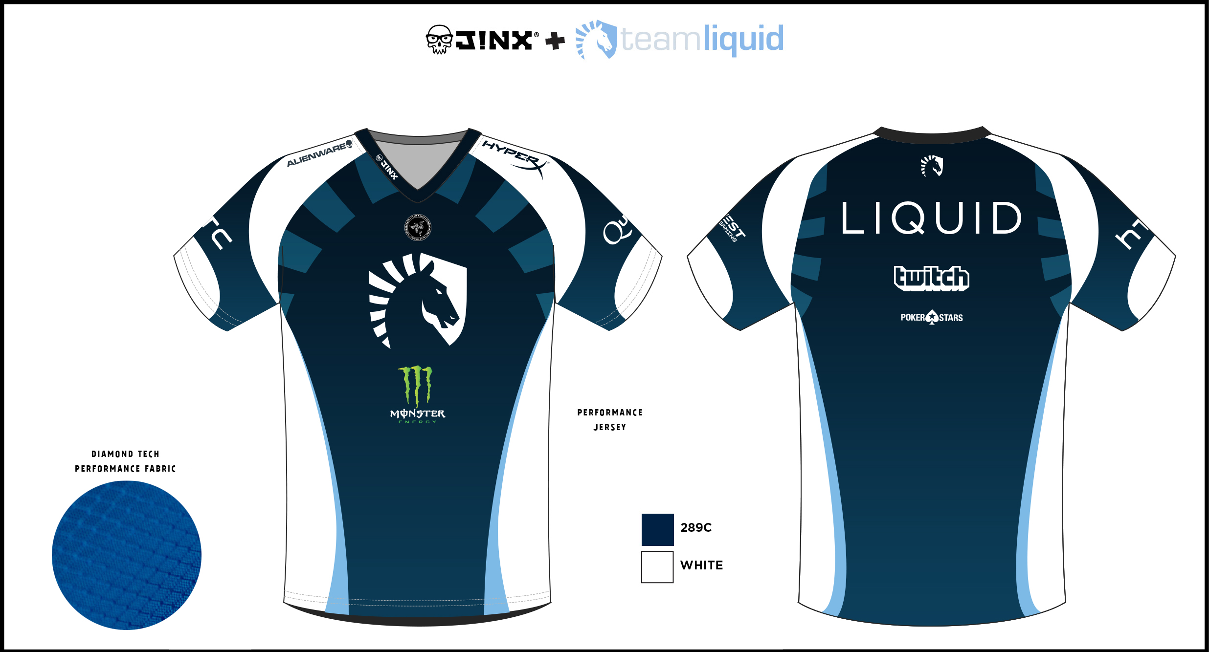
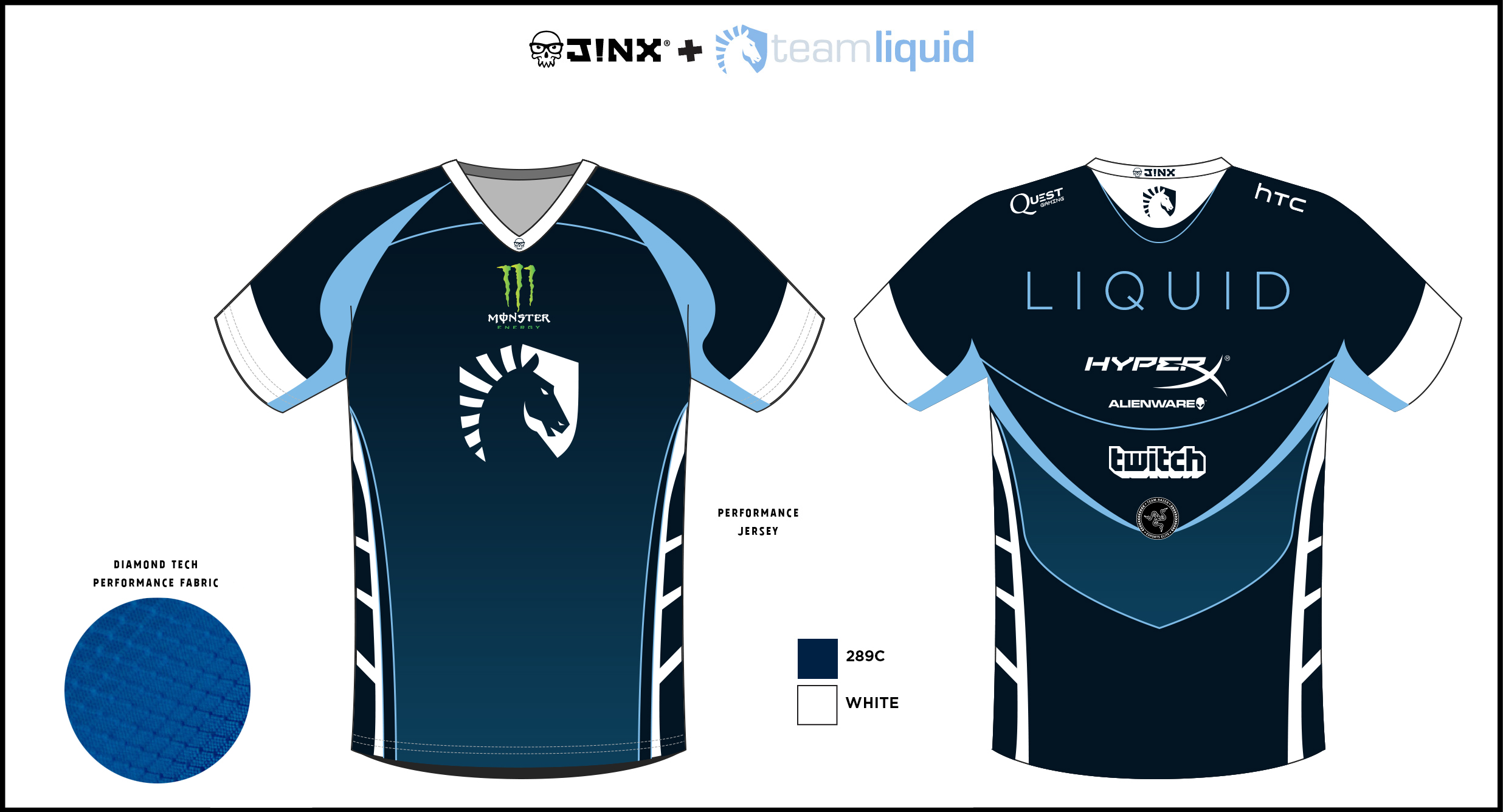
With the Liquid Store launching soon™, a lot of people probably wonder: how does Team Liquid figure out their jersey designs? Many questions come up as pencils and pens trace across sheets upon sheets of what could be the next new jersey in Team Liquid’s Design department. What colors go well together? What material is best? Why do certain designs look better than others? Why should the logo be a horse and not a cat? Why did we not choose a bright yellow with neon orange? Why does Monster take up a sleeve and not the entire back?

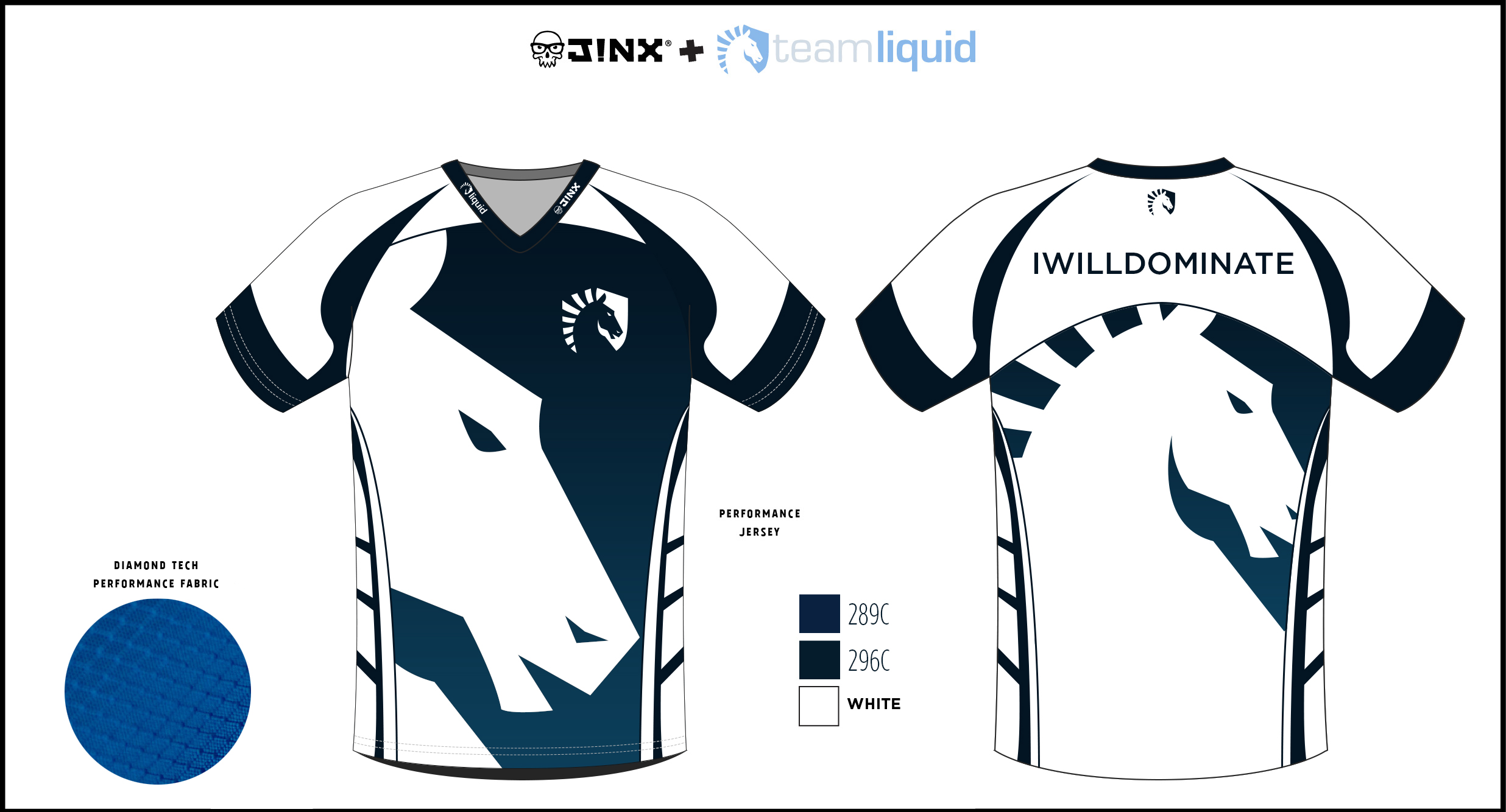
The legendary Winged Horse design that appeared on Liquid's first shirt
Luckily, all of these questions can be answered! Joshua Flowers, Team Liquid’s Design Lead, has some excellent insight on how the jerseys are made. From brainstorming to revisions, let’s hear it from the man himself on how it’s all done!
Tell me about what exactly it is that you do as the Design Lead for Team Liquid.
A lot of what you see, from the marketing campaigns we go through to overseeing the graphic designers is part of what I do. I also work with Damian, who works with 1UP, on their content as well as the design for the team jerseys. I’m essentially the art director, it just isn’t my official title. *laughs*

How long have you been designing the team jerseys?
I wasn’t around when the first original design came out. Additionally, the graphics team back then was pretty small. It wasn’t until the latter part of 2015 to early 2016 that I began to work on what you see now as the iconic Team Liquid jersey. That makes it about 2 - 3 years that I’ve been working on them.
Tell me about how the brainstorming process works when you’re first designing the jersey.
When we first started working with the design, we had actually switched from an ordinary T-shirt to athletic apparel when J!NX got onboard. At that point, we looked at the jersey material and saw that we could do a lot with what was provided.
I did a lot of research into different sports jerseys as well as jerseys from other esports organizations. From there, I took what I saw and planned out how the jersey would look like, from how the sleeves will look to the placing of sponsor logos to the different line angles on the back. I wanted to be sure that not only did the jersey itself look good, but it also enhanced a player’s appearance. Each of the players are of different sizes and shapes, so I wanted to make sure that the design looked great for everyone.
I did a lot of research into different sports jerseys as well as jerseys from other esports organizations. From there, I took what I saw and planned out how the jersey would look like, from how the sleeves will look to the placing of sponsor logos to the different line angles on the back. I wanted to be sure that not only did the jersey itself look good, but it also enhanced a player’s appearance. Each of the players are of different sizes and shapes, so I wanted to make sure that the design looked great for everyone.
How do you decide the different components of the jersey? Where does the inspiration for those components come from?
A lot of the inspiration came from the staff’s love for soccer and looking through different soccer jerseys. The manufacturing also played a key role in how the final look was going to appear. I wanted to keep it simple but keep it distinctive.
I work a lot with the other designers for input, but Damian definitely has one of the biggest influences on how the jersey will look. He watches the players like a hawk when they compete in tournaments, so we take into consideration how the jerseys look in different places. For example, we look at how the jerseys look on stage and how they look like from a distance. We want to be sure that when someone sees the jersey that it’s iconic.
Price is also another thing we look into. We want to make sure that these jerseys are accessible to our fans without breaking their banks. These are just a few of the many things we look at when we’re designing the jersey.
I’m sure you go through several revisions while going through the design process. What goes on in your mind during this time?
A lot of it has to do with the manufacturer and the material of the jersey itself. Who knows, maybe Team Liquid will figure out how to create their own polymesh. *laughs*
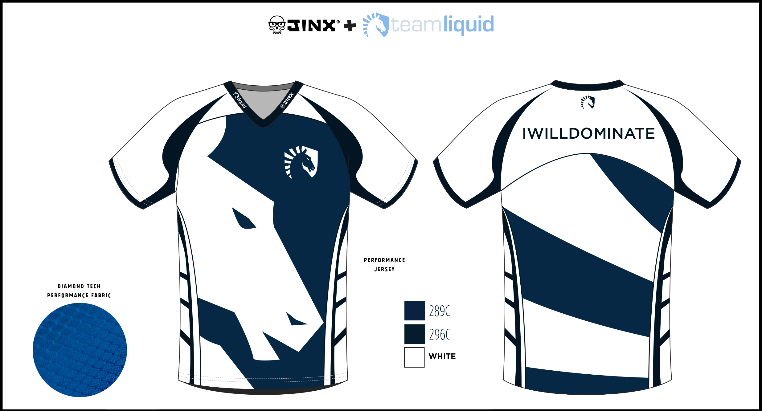
We had a phase where we were deciding between different colors for the jersey. At one point, we had a blue-blue scheme and a blue-white scheme. Eventually, we saw that while they both looked nice, the blue-white scheme overall looked a lot better, so we stuck with that.
When we look at jerseys that are limited edition, we take into consideration the event where this jersey will be showcased, or the holiday that the jersey is based upon. In the case of MSI, we really wanted to capture the spirit of North America while still keeping the identity of Team Liquid. That’s what we aim to do: keep the iconic Team Liquid design, but make it fresh.
Are there any designs that you personally would like to see on a future jersey?
Since designing the jersey, I find that input from others helps us to create and brainstorm potential new ideas for the jersey. As of now, I don’t have anything. We’ve had a few people do some really wacky things like invert the logo (which is so funny because after the reveal, I thought that it just didn’t feel right since the iconic logo had stuck with me for so long). Tiffany, one of the other designers, thought about making all the logos look glitchy just for fun. Of course we experiment every now and then with crazy ideas, but when it comes down to the final jersey design, we keep it simple and professional.
Anything else you’d like to say?
I’m super proud of the way the jerseys look now, and I’m always looking forward to making the jersey better than the last. Be on the lookout for what we have in store next time!
Our new store will be launching soon, so get your hype ready (along with your preferred payment method), because you definitely don’t want to miss out. Let’s go, Liquid!